A wine label decides whether the bottle gets picked up. Not the vintage. Not the score on the back. The label. People judge bottles in seconds, and the paper, ink, and finish do most of the talking before the cork comes out. Getting a personalised wine label wrong is quite expensive. The wine inside might be excellent. The bottle still looks like a school project.
The Bottle Does More Than Hold Wine
A personalised wine label can mark a wedding, a birthday, an anniversary, or a small-batch run from a boutique NSW winery. The reason behind the bottle changes the choices that follow.
Three things shape how a personalised wine label feels in the hand:
- The face stock (the paper or film)
- The finish (gloss, matte, foil, varnish)
- The print method and ink
Each one shifts the result. Skip any, and the bottle gives off the wrong signal.
What Material Actually Suits a Wine Bottle
Wine labels live on glass, in cool rooms, near condensation. The material has to handle all of that without lifting or going soggy.
Three material families cover most personalised wine labels: textured papers for a high-end look, coated or uncoated papers for everyday use, and film stocks like polypropylene when moisture resistance matters.
Coated paper. Smooth, slightly glossy surface. Prints sharply, holds detail, resists splashes better than uncoated stock.
Uncoated paper. Softer, more natural feel. Absorbs ink, which gives prints a deeper, slightly muted look. Suits boutique batches, struggles in ice buckets.
Estate or felt-textured paper. The standard pick for premium wine. It handles a bit of condensation but breaks down with heavy moisture or rough conditions.
Polypropylene (BOPP) film. The durable option. Clear BOPP gives a no-label look on the glass. Matte white BOPP suits chilled whites, sparkling, and rosé, where condensation is part of the day.
Finishes That Lift a Label, and Ones That Don’t
Matte. Quiet, refined, easy on the eye. Works well with darker colours and classic branding.
Gloss. Brighter and sharper. Good for bold designs, but it reads as cheap with the wrong artwork.
Satin or semi-gloss. A soft sheen that brightens colour without reflecting too much light back.
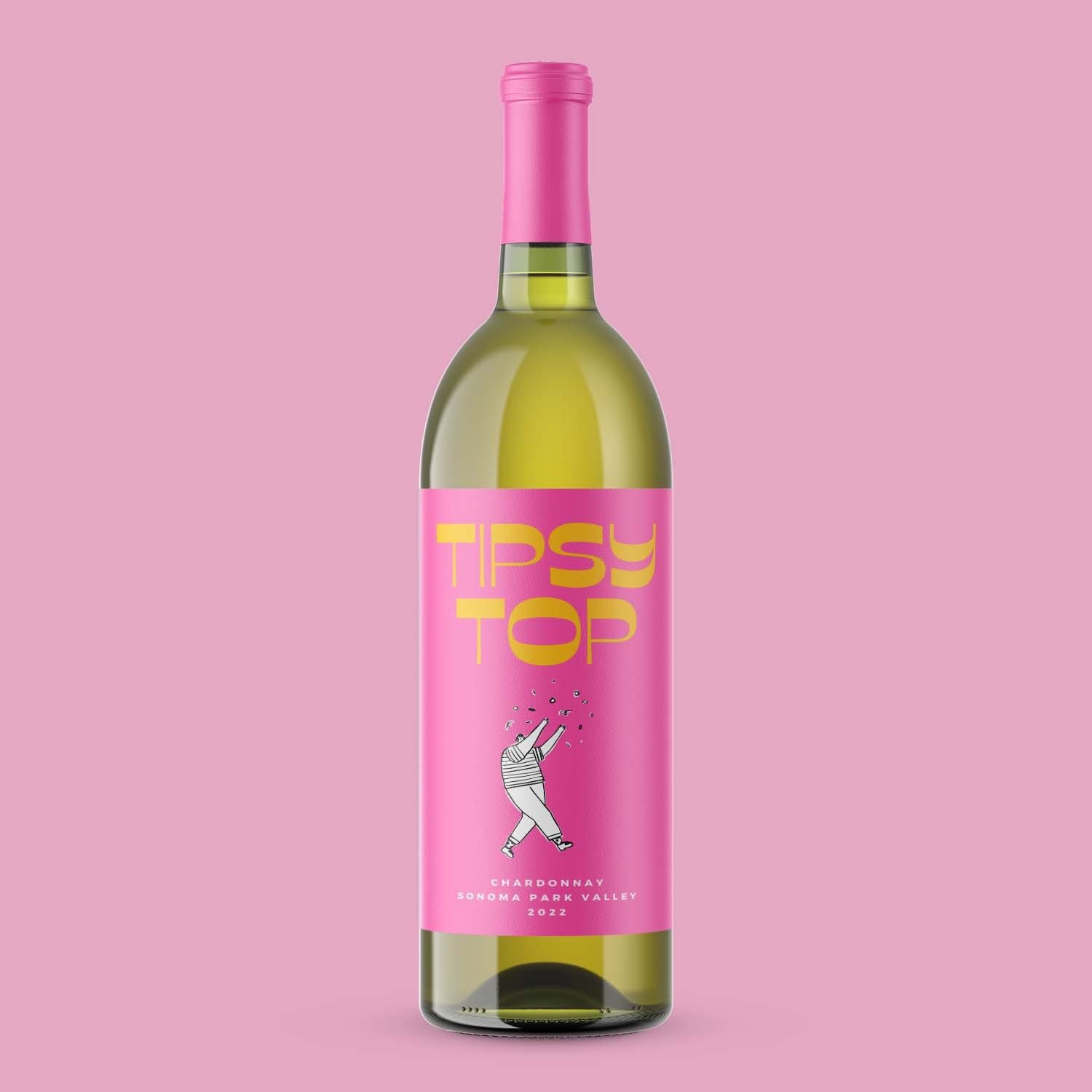
Foil stamping. Gold and silver are the obvious picks. Used sparingly, foil lifts the bottle. Used everywhere, it looks like a Christmas card.
Spot varnish. Clear gloss is applied to specific parts of the label, often over an illustration or logo. It adds depth without clutter.
Where Personalised Wine Labels Often Go Wrong
The harder part. Most personalised wine labels fail in predictable ways.
Too much going on. Photos of the couple, three fonts, a quote, a date, a winery name. Edit hard. One focal point per label.
Wrong material for the storage. Textured uncoated paper on a bottle that lives in an ice bucket will curl within an hour. Match the material to the conditions, not just the look.
Hard-to-read type. Wedding labels suffer most. Calligraphy at small sizes turns into a smudge from a metre away. Test the artwork at actual size before ordering a hundred bottles.
Foil overload. A whole label in foil washes out under shop lighting. Reserve it for one or two accents.
Low-resolution artwork. A photo from a phone stretched across a label prints fuzzy. Use vector files for logos and a 300 dpi minimum for photos.
A forgotten back label. The front gets attention, then the back ends up as plain text. Treat both as one design system.
A Note on the Legal Bits
Wine labels in Australia have to carry the producer details, the wine name, the type, the vintage year, the region, the alcohol content, certification marks, and the bottle’s volume.
Personalised labels for weddings and gifts sit in a softer space. If the bottle is being sold rather than gifted, the rules still apply. Skipping them is not a creative choice.
How to Order Without Wasting a Run
LabEX runs as a fully online platform. Artwork goes up through the website, materials get picked from the spec list, and a quote comes back without a phone call.
Three steps worth taking before placing the full order:
- Request a sample pack to feel the textures and weights.
- Order a small test run before committing to a large quantity.
- View the artwork at 100% size on screen, then print it on plain paper, before signing off.
That short check catches the kerning slip, the colour mismatch, and the tiny logo most people only notice once a hundred bottles are sitting in the garage.
See also: How Businesses Can Accept Crypto Payments
Worth Getting Right
A personalised wine label is a small object that does heavy lifting. The right material holds up. The right finish makes the bottle feel considered. The wrong choices show up the moment someone picks the bottle up.
Pick the stock first, then the finish, then the artwork. In that order. The bottle will thank you.